
Refreshing Suzuki’s Digital
Experience

A visual refresh of Suzuki Israel’s website, designed to bring the brand’s digital presence up to date while staying true to its familiar identity. The new UI creates a cleaner, more consistent experience across pages, components, and screen sizes, with a stronger focus on clarity, usability, and the cars themselves.

Role
Product Designer - UX/UI
Timeline
2024
Platform
Web · Responsive
Client
SUZUKI
Tools
Figma
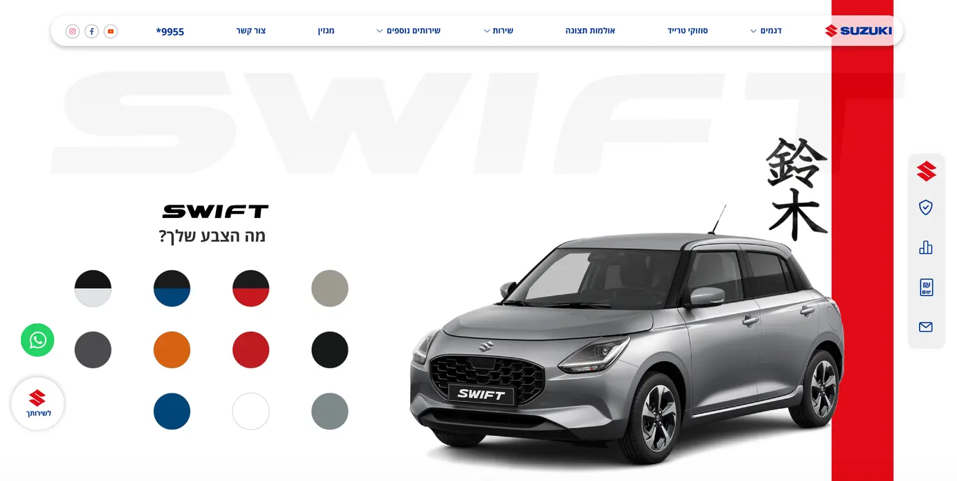
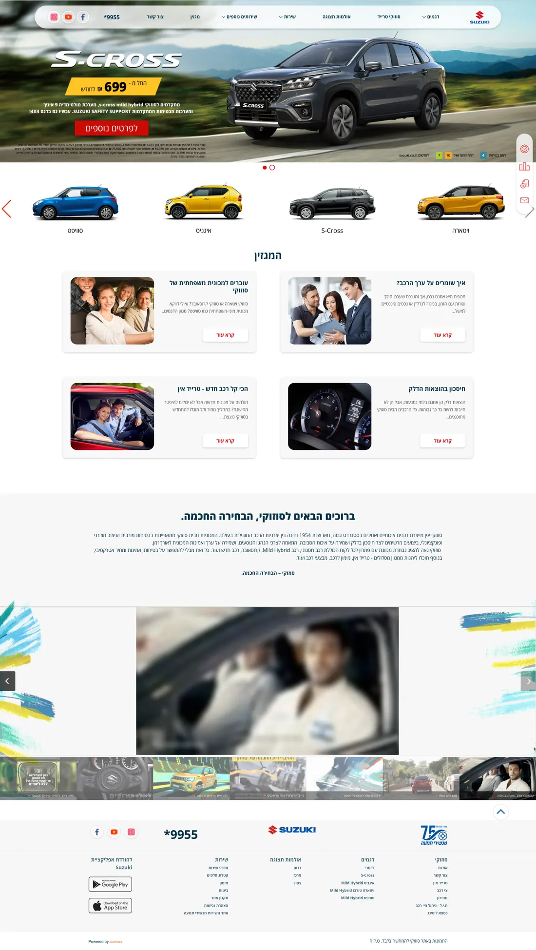
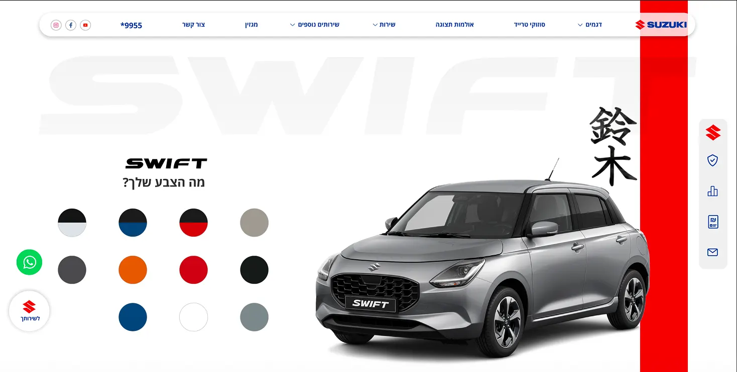
Suzuki Israel homepage after the refresh
01 / Overview

Bringing Suzuki’s Brand Into the Digital Experience

As part of the Comrax team, I led the visual refresh of Suzuki Israel’s website, with the goal of creating a more modern, clear, and consistent digital experience while keeping the brand familiar and recognizable.

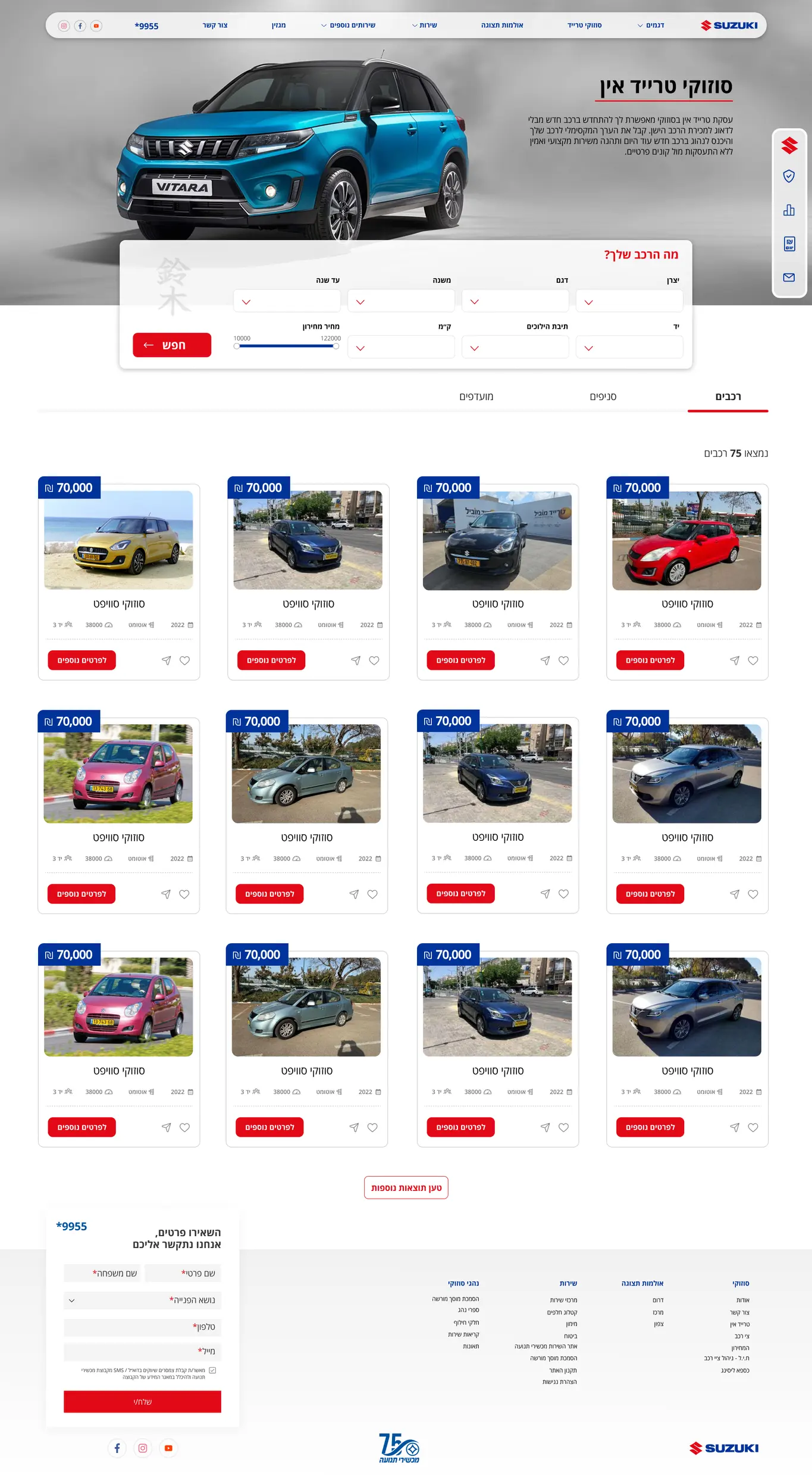
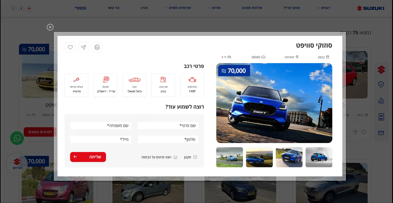
The project covered the visual language across the full website. From the homepage and model pages to trade-in, services, forms, content, and mobile. The challenge was to bring all these different areas together under one design approach, while giving the vehicles a stronger presence and making information and key actions easier to find.

The new UI builds on Suzuki’s practical and approachable character through clear hierarchy, strong imagery, focused use of the brand colors, and a consistent set of components that works across pages and screen sizes.
02 / Why Refresh?

Evolving the Experience, Not Replacing It

Suzuki Israel already had a familiar digital presence and a clear brand identity. The goal wasn’t to redesign everything from scratch, but to improve how that identity works across a large and content-rich website.

The refresh focused on clearer hierarchy, stronger consistency, better use of space, and a more modern visual language, while keeping the experience familiar for existing users.

  1. 01

    Clearer Hierarchy

    Give vehicles, key information, and primary actions a clear place in every screen.

  2. 02

    More Consistency

    Create a shared visual language across model pages, services, trade-in, forms, and content.

  3. 03

    Still Suzuki

    Modernize the digital experience while keeping the colors, character, and familiarity of the Suzuki brand.

04 / Design

Bringing the New Visual Language to Life

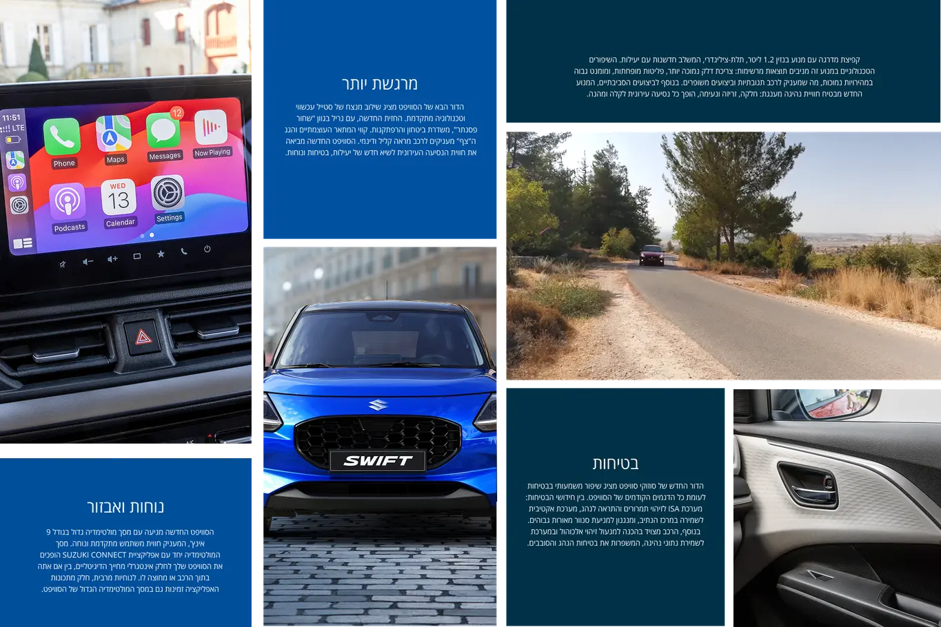
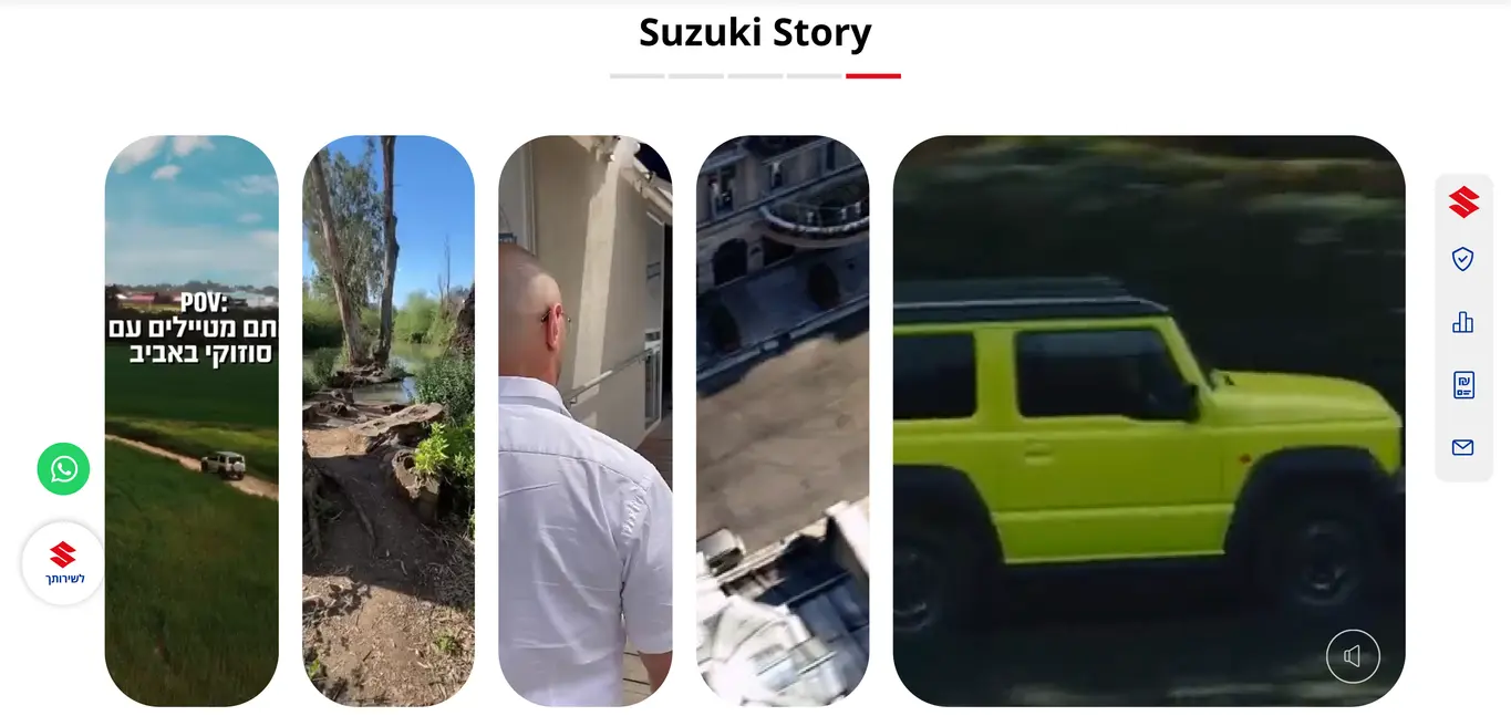
Suzuki’s red is used with purpose and highlighting key actions and important elements without taking over the interface. The layouts combine strong vehicle imagery, clear typography, and generous spacing to create a clean, recognizable Suzuki experience across the site.

05 / The Transformation

Seeing the Refresh Side by Side

Looking at the old and refreshed experiences side by side shows how small, focused design decisions changed the overall feel of the site. Stronger hierarchy, more space, clearer actions, and a more consistent use of Suzuki’s visual language created a cleaner experience without losing the familiarity of the original.

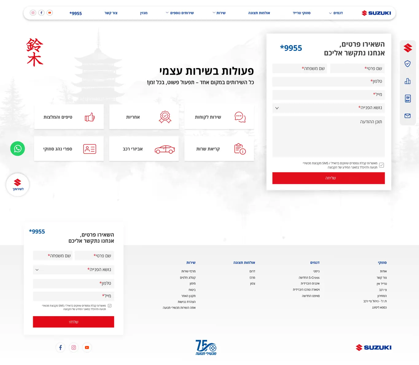
01 / Homepage - Giving the Main Experience More Focus

Old Suzuki Israel homepage
Old Website. Multiple visual elements competed for attention, making the vehicle, key message, and primary action less clear.
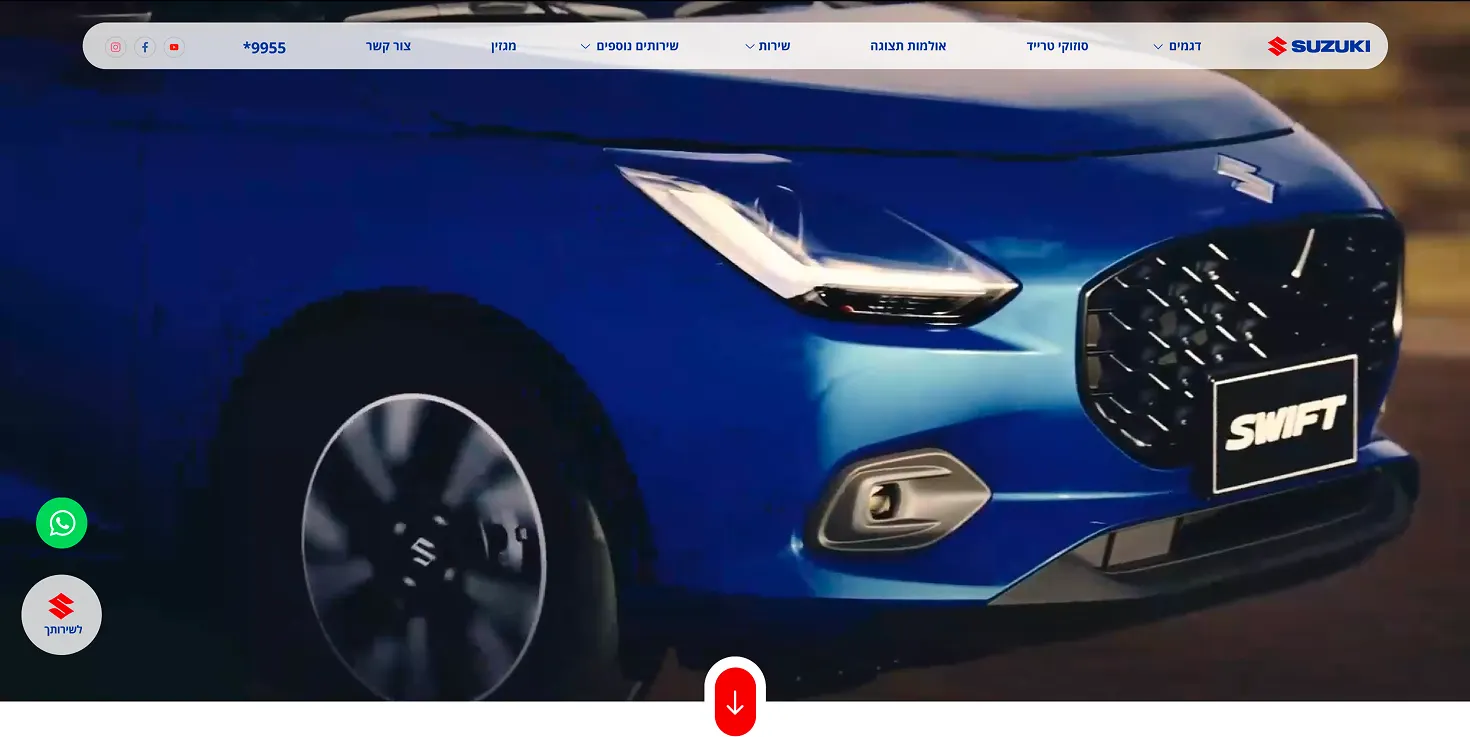
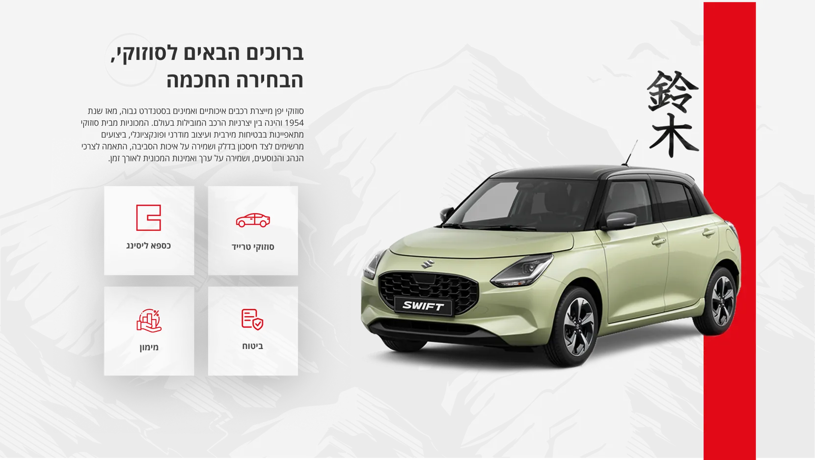
Refreshed Suzuki Israel homepage
Refreshed Website. A stronger visual hierarchy puts the vehicle, key message, and primary action at the center of the experience.

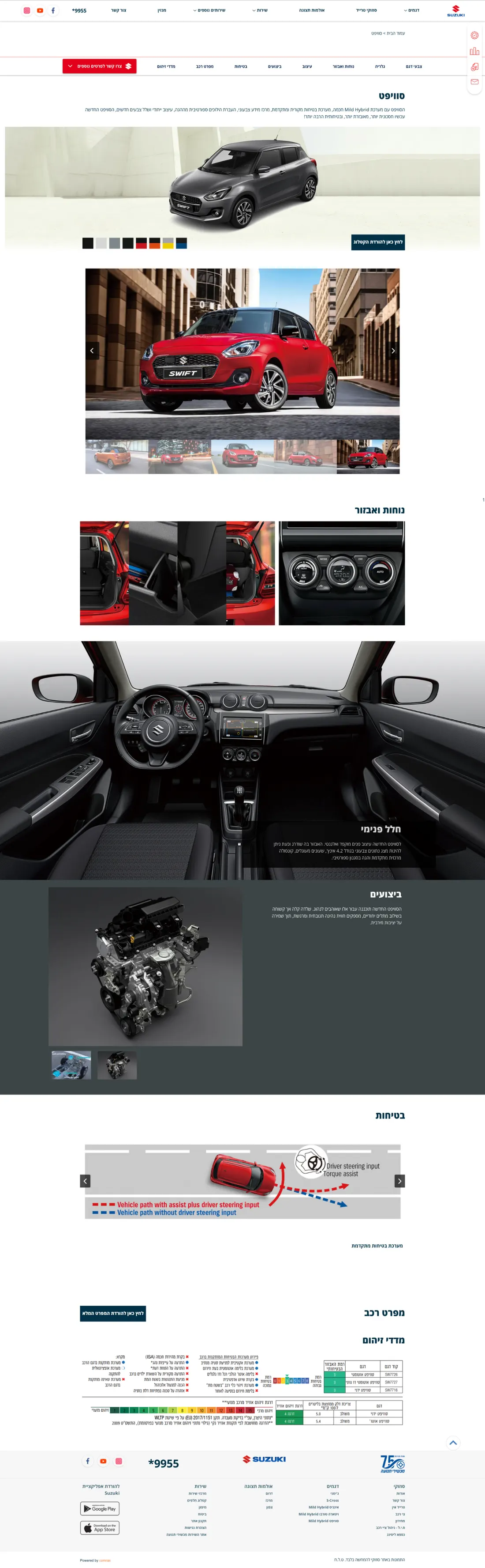
02 / Model Page - Making Vehicle Information Easier to Explore

Old model page
Old Website. The model page presented the essential vehicle information in a more traditional, functional layout.
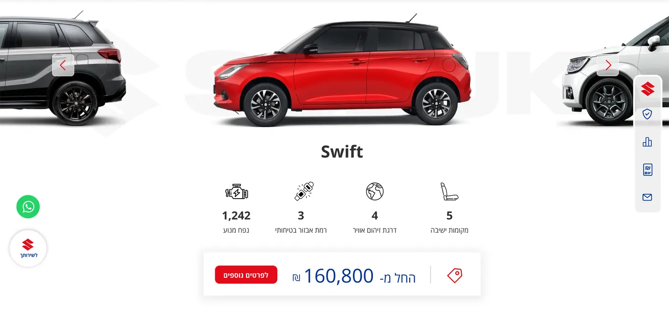
Refreshed model page
Refreshed Website. A more visual and interactive experience brings the model to life, combining bold imagery, intuitive interactions, and engaging moments throughout the journey.

03 / Mobile - Designed for the Mobile Experience

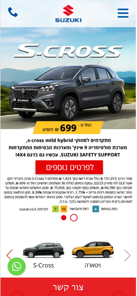
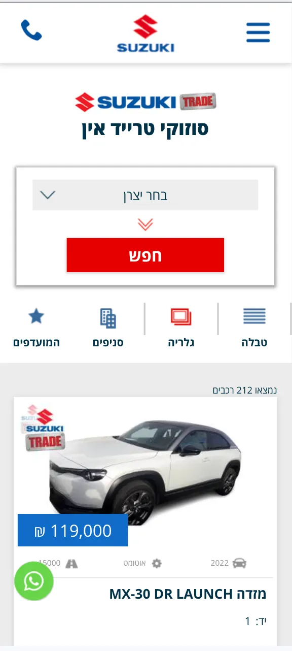
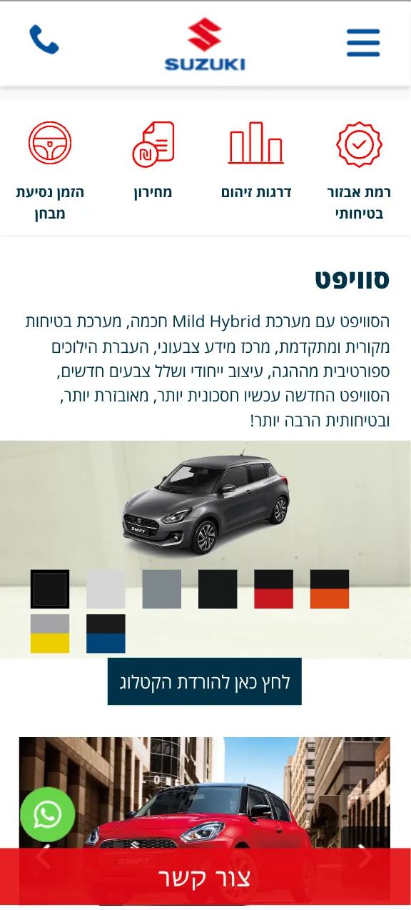
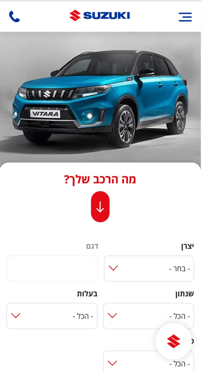
Old mobile screen 1Old mobile screen 2Old mobile screen 3
Old Website. The mobile experience felt closer to a scaled down desktop layout, with limited consideration for touch, spacing, and content flow.
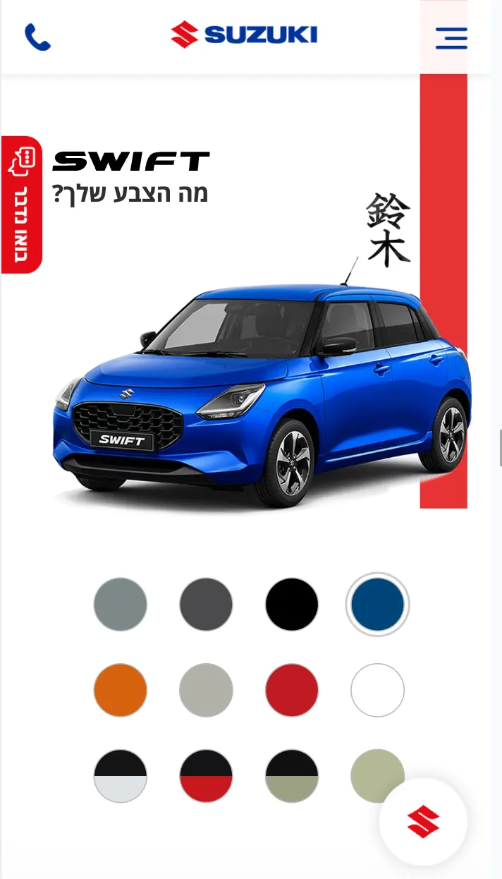
Refreshed mobile screen 1Refreshed mobile screen 2Refreshed mobile screen 3
Refreshed Website. A mobile first approach creates a more intuitive experience, with clearer content hierarchy, optimized spacing, and touch-friendly interactions.
06 / Design system

A Consistent System for Suzuki

The design system brings Suzuki’s digital language into one consistent set of colors, typography, icons, buttons, cards, and UI components. Suzuki red is used as the main action color, supported by a neutral palette, a clear type scale, and a custom icon set designed for vehicle specs and key information.

Palette

#C8102E #1F262E #003399
Slate Line Surface Paper

Buttons & Components

Search Book a drive
New Hybrid ₪91,000 לשירותך 10000122000

Type & scale

Open Sans
Hebrew-first · headings, body and data
3422161413 · caption

Iconography

Suzuki service icon set: documents, licence, vehicle, parts catalogue, accident, service call, recommendations, warranty and customer service
07 / Impact

A Clearer Digital Experience

  • Live

    Designed, developed, and running on suzuki.co.il.

  • AA

    Accessibility considered across components, interactions, and screen sizes.

  • 1 System

    One visual language connecting the experience from desktop to mobile.

The refresh gave Suzuki Israel a clearer and more consistent digital presence while keeping the brand familiar. Stronger hierarchy and clearer actions make it easier to explore models, find information, access services, and move between different areas of the site. The result is a responsive, accessible experience that feels recognizably Suzuki.